
LinkedIn User Research: A ReDesign of the Profile Page Interface
3 Months (1.5 months on UX Research, 1.5 months on Wireframing, Prototyping, and Usability Testing)
Solo Project
Product Film
Overview
When LinkedIn was launched in 2003, it quickly garnered attention as a professional networking and career development hub where job seekers post their resumes and employers post jobs. In more recent years however, LinkedIn has lost its initial magic in connecting people to opportunities. With the ever growing competitiveness of jobs, job seekers are finding it harder to use LinkedIn to find their dream job and “networking” has become a superficial feature on the platform to say the least.


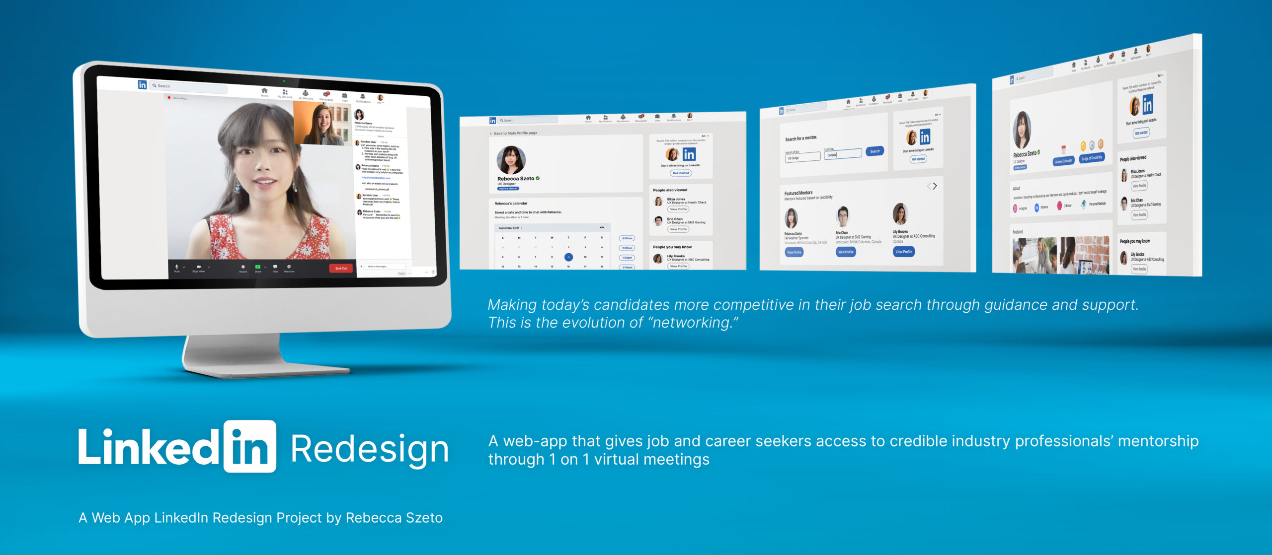
Searching for a job and waiting to hear back after sending in hundreds of applications can feel defeating. There is often very little feedback on what can be done to improve a job seeker’s competitiveness and the gaps they need to fill, skills and career wise. LinkedIn mentorship is a web-app that creates an inviting space for job seekers to feel supported in their job and career search journey by a redesigned profile page ecosystem where job seekers can book a time to speak with a mentor (an accredited industry professional) 1 on 1. They receive career and job skills advice, portfolio reviews, and an opportunity to ask the mentor any questions that they have about an industry of their interest. This is the evolution of “networking” and is what makes a candidate more competitive in their job search through guidance and support.
*All information in this case study is my own and does not necessarily reflect the views of LinkedIn.
The Challenges
Determine if a professional is influential/credible in their space and is closely affiliated with their industry peers.
Difficulty/inconvenience in scheduling a virtual meeting with the professional.
Meet Sam and Alex


Meet Sam and Sam’s Needs
Meet Alex and Alex’s Needs
“When I view someone’s LinkedIn profile to see if they can help connect me with an opportunity, I want to be able to determine if they’re credible on the spot, so that I only connect with the right people.”
“When a person accepts my invitation to have a conversation, I want to be able to schedule a call/meeting with them asap, so that I don’t miss out on a job opportunity.”
Success Metrics:
Project Impact and KPIs
Project Impact
Talking to People: User Research and User Testings
The positive impact of putting this project together are the results gathered from the insightful conversations that I had with my participants throughout the project.
The conversation that I had with my participant during user research uncovers the real concerns that job seekers new to an industry (my target user group) are facing today. A job’s threshold for entry gets increasingly higher but many jobs are surprisingly left unfilled. This prompted me to look into the possibilities of filling in this knowledge and career gap for career/job seeking individuals.
The solution that I’ve created is a mentorship platform within LinkedIn where mentors assist juniors new to the industry by giving them career advice through 1 on 1 and group mentoring sessions virtually.
Through 2 stages of user testing, I learned that integrating a new ecosystem to an established platform such as LinkedIn requires a lot of considerations such as its seamless integration to the platform alongside LinkedIn’s existing features, whether or not this should be a product available to all users (I’ve set it to be a Premium member product in this case), and how LinkedIn Mentorship ranks among its competitors.
Therefore, having all these conversations allowed me to come up with a final product that addresses all these aspects.
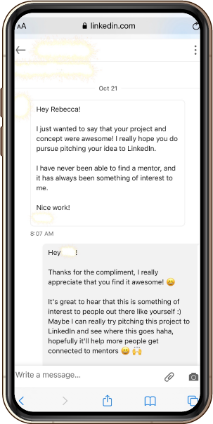
KPIs to Track (All Successful – Results from Latest User Testing)
- Participants understand how to search for a mentor on the platform
- Participants find it straightforward to check the credibility of a mentor
- Participants understand how to select the skills they want to be mentored in and connect with the mentor
- Participants know how to check the status of the connection requests sent to mentors
- Participants know how to manage bookings with mentors
- Participants understand how to join a scheduled meeting with a mentor
- Participants understand how to join a group mentoring workshop
- Participants report satisfactory comments of using the product and each individual feature
*Please refer to Final Thoughts for KPIs to track for real users should/when this product does launch.

User Research
User Interview
For my user research, I decided to conduct a semi-structured user interview with my participant. Through speaking with my participant (a UX student looking to enter the UX field – a new space for her) in the interview, I learned that in her case, she’s experiencing this concern of not knowing how to approach and/ a new career like most of my other users I’m targeting for this project.
After the user interview, I noted all the important and/ interesting points that the participant mentioned during the interview by listening to the entire audio recording of the conversation.

Affinity Mapping
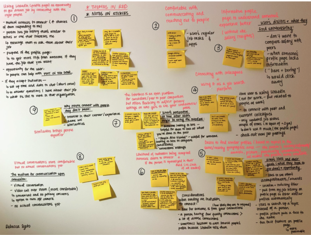
This video shows my research synthesis process for my user interview responses by conducting an affinity mapping activity to identify the themes, which in turn helped to write the problem statements for this project.
Affinity Mapping Activity
For my affinity map, I’ve identified 9 unique themes in my participant’s responses, which I in turn transformed into 9 unique problem statements that I believe my target user group are facing.
Problem Statements
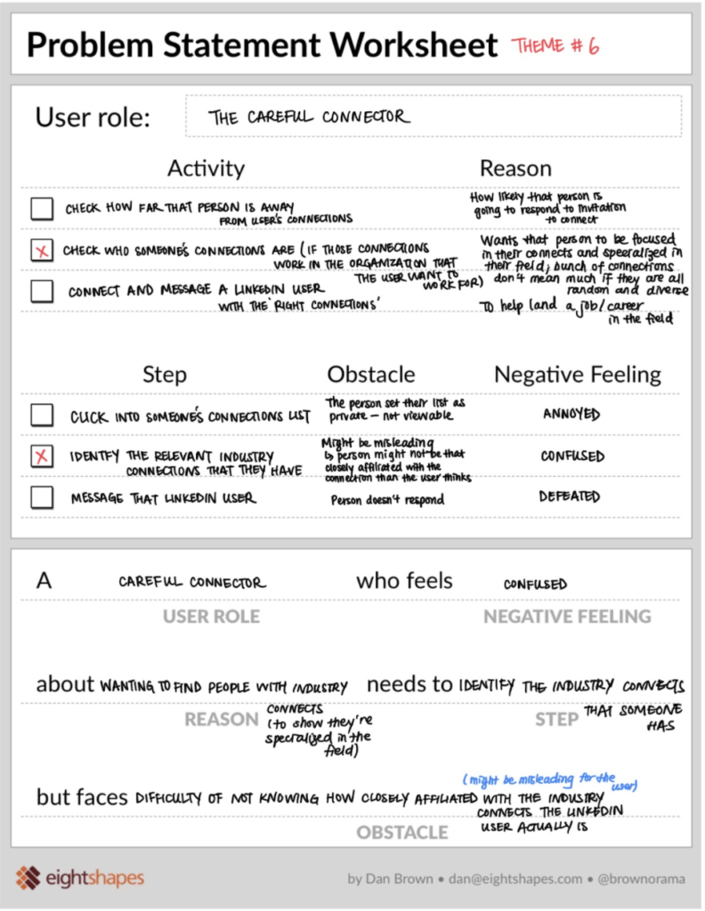
In the first problem statement, the user wants to ensure that the industry professional that they’re connecting with is credible. That includes how closely affiliated they are with their industry peers. However, the user is faced with the difficulty of identifying which mentor/professional is credible based on the info of a LinkedIn user on the profile page interface.
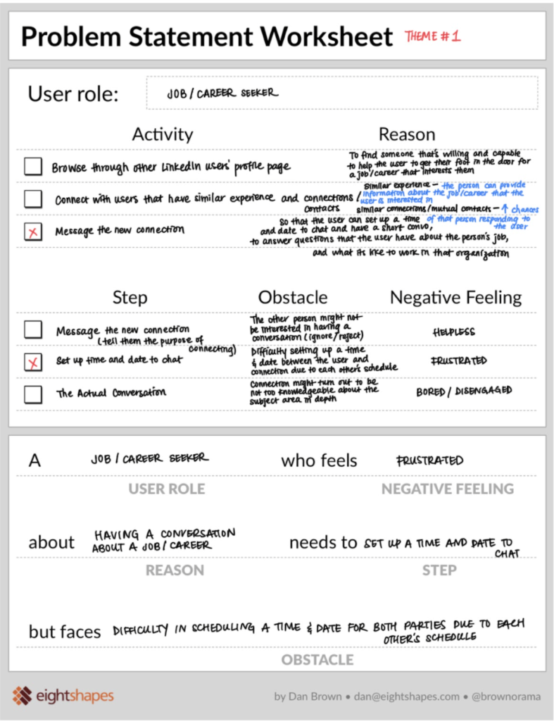
In the second main problem statement, the user wants to message their new connection by setting a time to chat in order to learn more about the new industry of interest to them (and any other questions that they may have). However, with the current LinkedIn platform, it is not easy and convenient to do so without much back and forth on each other’s availability.
UX Research Final Presentation and Workshop Plan Proposal:
This is a video of me presenting my UX research process and workshop proposal plan to the class and the instructor. See how I answered a thought-provoking challenge question pertaining to team collaboration between different team members from each department towards the end of the video!
I executed the actual workshop outside of class – here’s the intro:
A workshop video executed according to the workshop plan proposed in class. The actual execution of the workshop wasn’t required, but I decided to take this on outside of class to have it as a learning experience.
Here’s the Divergent Game to get the entire project team (imaginary – it’s just me and another person!) to brainstorm all the possible challenges of the current interface and possible solutions:
Sharing and Collaboration Ideas from the Challenge Cards Game – 20 Minutes Whiteboard Challenge!
Crazy 8s Workshop:
Creative Brainstorming – An Agile Design Sprint
I like that the Crazy 8s Workshop forces me to not be fixated and attached to only 1 or 2 solutions during the entire session. The limited time that I have on each frame (1 minute each) naturally pushes me to the next frame once the 1 minute is up. No matter how good I think an idea is, I move onto the next one without dwelling or perfecting on any specific solution.
This allows me to consider alternatives, to come up with as many different ideas as possible under the time limit, and most importantly, be open minded to different possibilities when quantity is a requirement and not an option.
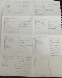
Presenting my 2 Design Problems to my Classmates for Our Crazy 8s Sketching Workshop
Crazy 8s Sketches
User Flow and Sketches
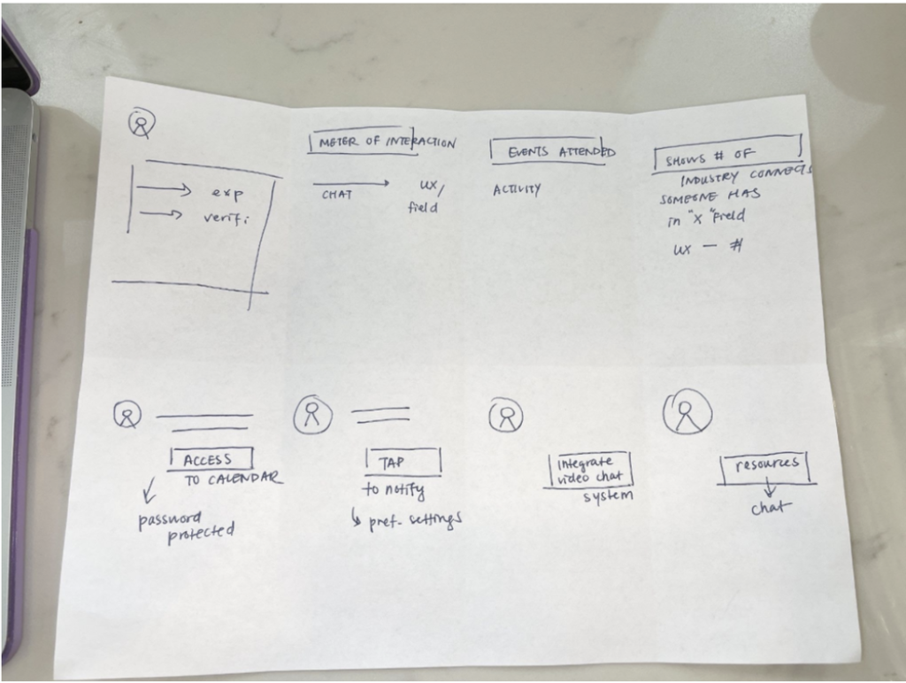
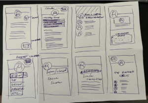
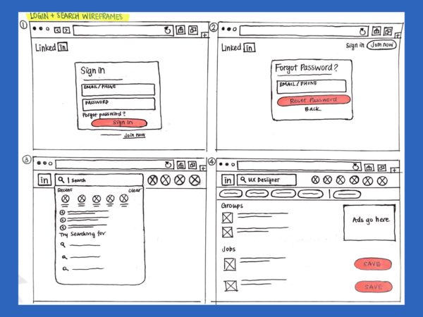
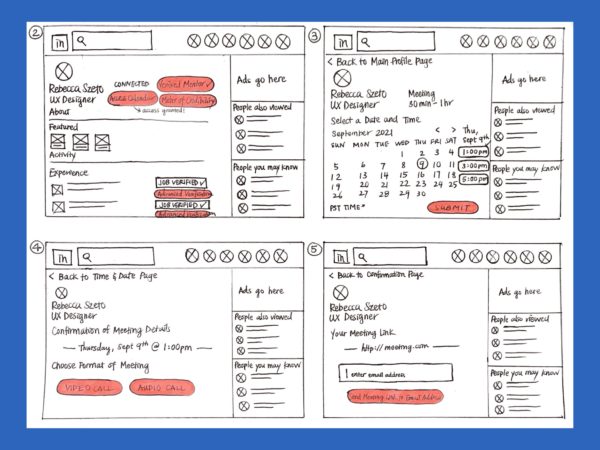
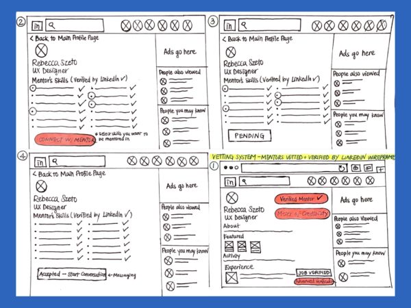
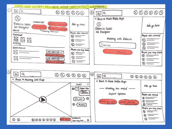
Taking my learnings from my user research (user interview) and research synthesis (affinity mapping and problem statements), the features to be created are determined, and the following user flows are created and turned into first initial sketches (low-fidelity wireframes).
Here are 4 out of the 7 features:
User Flow
Even in the early stages of low-fidelity mockups, I was cognizant of creating multiple routes for the user. Should they deviate from the main path, there’s always alternative routes that would lead them back to the main one.
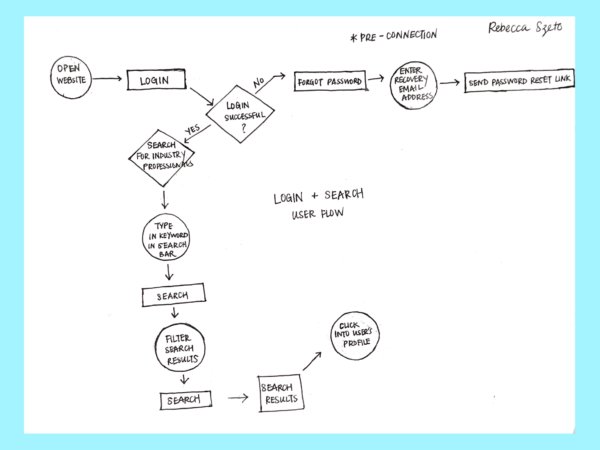
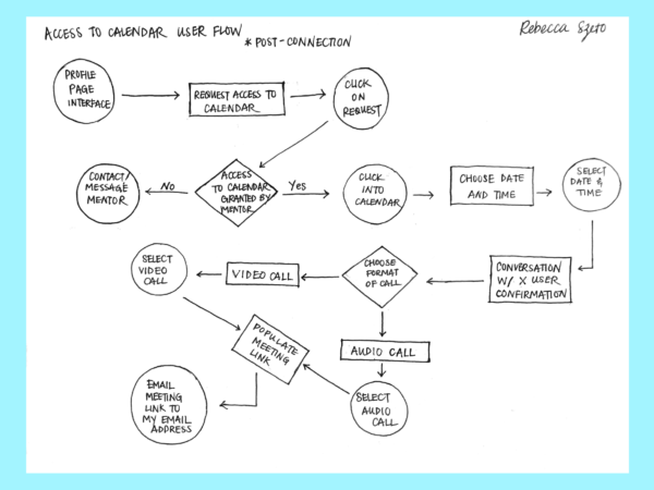
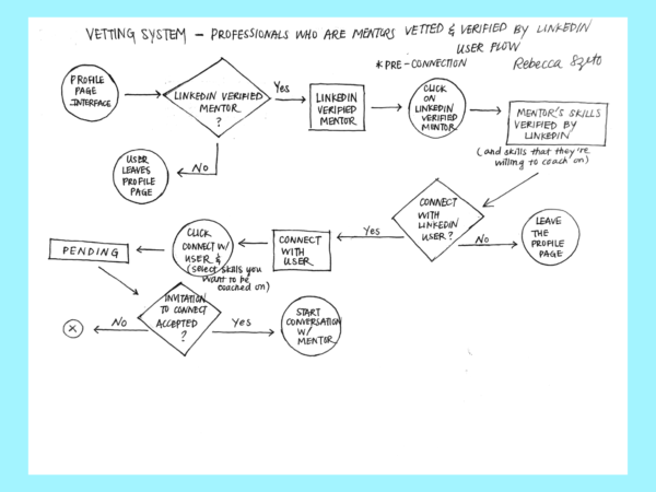
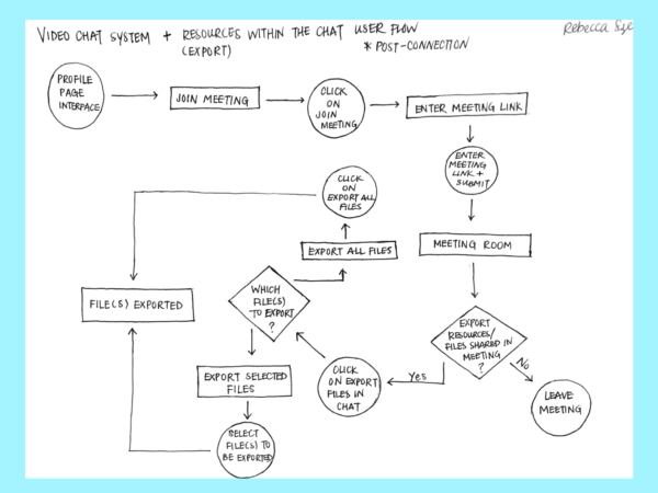
Sketches
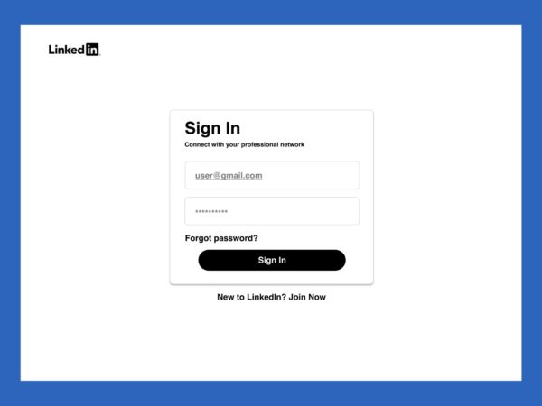
After having decided on the features and flow for each feature, I created low-fidelity wireframes for each feature. They give an overview of the frames included for each flow and where buttons are on each frame (highlighted in red). This shows the general flow of how each frame transitions to the next.
Mid-Fidelity Wireframes
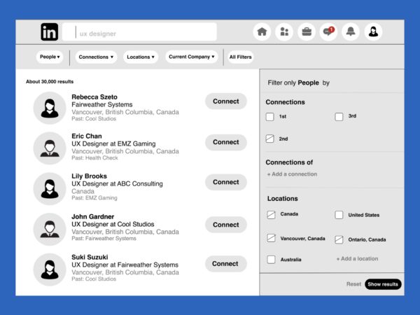
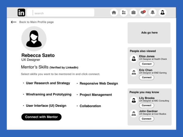
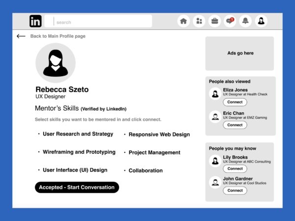
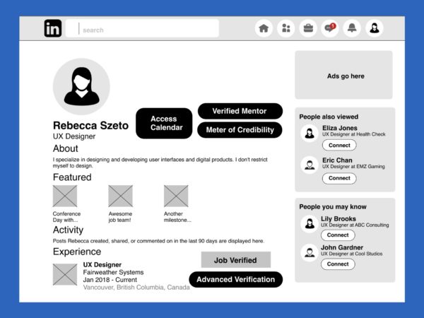
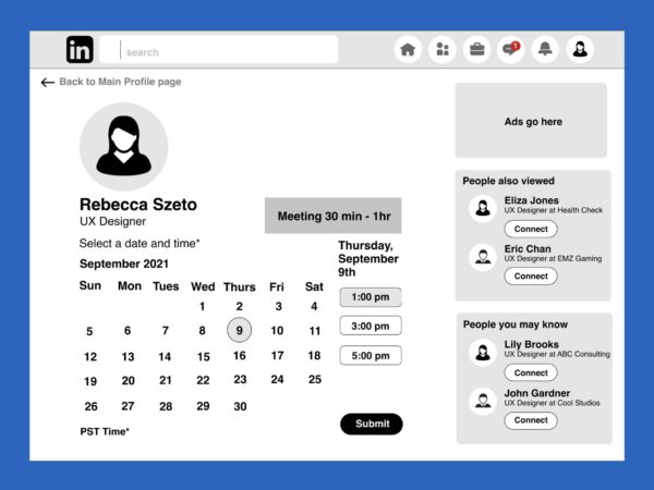
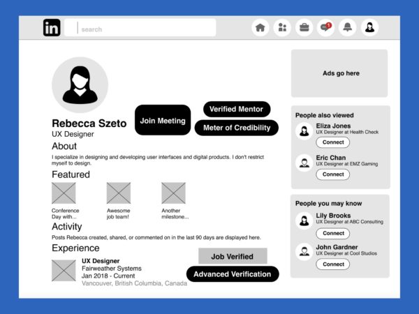
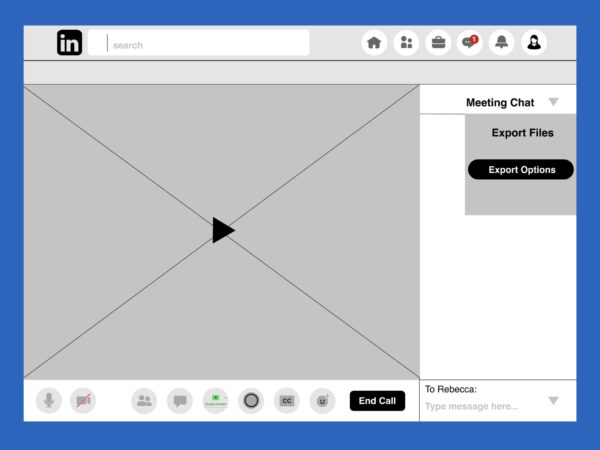
For the mid-fidelity wireframes, I created a grayscale version of all the frames that I drew out in my sketches. These frames all include real content of what would actually appear in the final product with font matching to that which is currently being used on LinkedIn.
I used the column layout for aligning everything. I worked with a 12 column gird with a 15px gutter. (That kept all my frames aligned, but I later realized that it wasn’t scaled to what was actually on LinkedIn’s browser. In other words, my frames were all aligned but they were all blown up – everything was too big. I had to scale everything down to LinkedIn’s sizing later on.)
1st User Testing, Rainbow Sheet Results, and Action Items
1st User Testing Results
Main Action Items After 1st User Testing
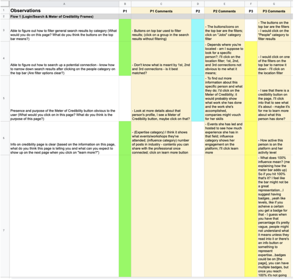
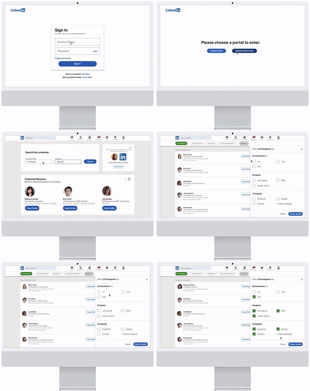
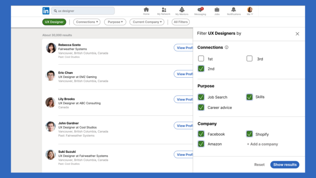
All the 3 participants were having difficulty with the 1st user flow (the search wireframes) – participants don’t intuitively filter search results by category even though there are filter categories under the search bar.
- Action Item:
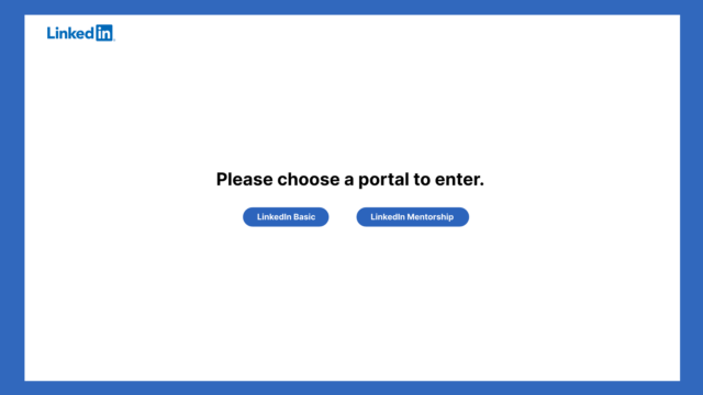
- Create an onboarding wireframe series with a different entry point to search and even the mentorship system as a whole could be a standalone ecosystem on the LinkedIn platform. This means that when the user logs in, they can enter a portal and go to a designated mentorship dashboard/ecosystem dedicated for users looking for a mentorship-mentee relationship.
- This ecosystem also helps the user to focus on what they set out to search for without their attention being diverted to other unnecessary content in the search results not relevant to what they’re looking for.
- Only Premium/paid users would be able to access this feature.
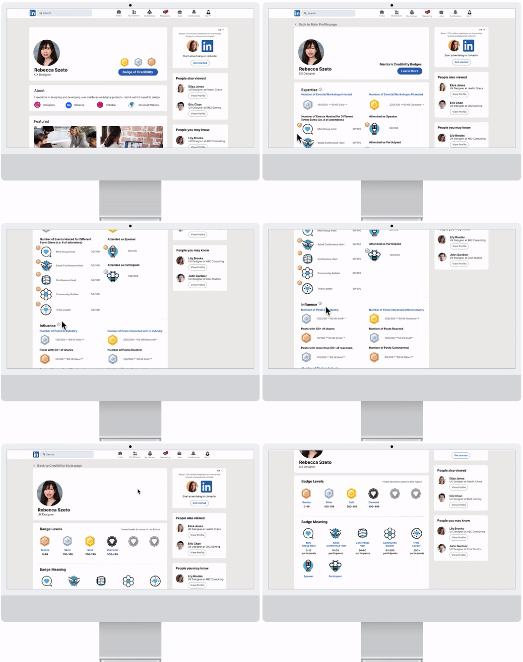
The Credibility Stats page and what each meter is showing under each heading is difficult to understand for participants – 1st participant asks how the percentage adds up, and the 3rd participant questions what a 100% full meter bar means. The 3rd participant mentioned that if 100% is the maximum and can’t increase from there, then the meter might not be a good representation of someone’s credibility and that the professional might not have the motivation in engaging as much once they hit 100%.
- Action Item:
- As the 3rd participant suggested, having a badge system would motivate professionals/mentors to participate more on the platform vs. having a meter bar. If they reached 100% they would become less inclined to be as active since they’ve already reached a maximum. In addition, a badge system would clearly explain what thresholds must be met in order for that mentor to obtain that badge – participants can hover or click on the badge to learn more – a clear understanding of how credentials are rewarded and such transparency would give the user more confidence in connecting with the mentor.
Participant #2 finds it tedious to go back to the profile page every time to check the status of whether or not a mentor has accepted their request to connect yet.
- Action Item:
- Allow users to check the status on the invitation page under “My Network.” To distinguish invitations sent to mentors versus other LinkedIn users in general, a designated tab will be created so all mentors’ connect requests will all be under one place. General connect requests and mentor connect requests should be distinguished from each other because for the latter you would have selected specific skills to be coached/mentored in and hence, such an invitation to connect would look and show up differently in the user flow (should be a different experience overall).
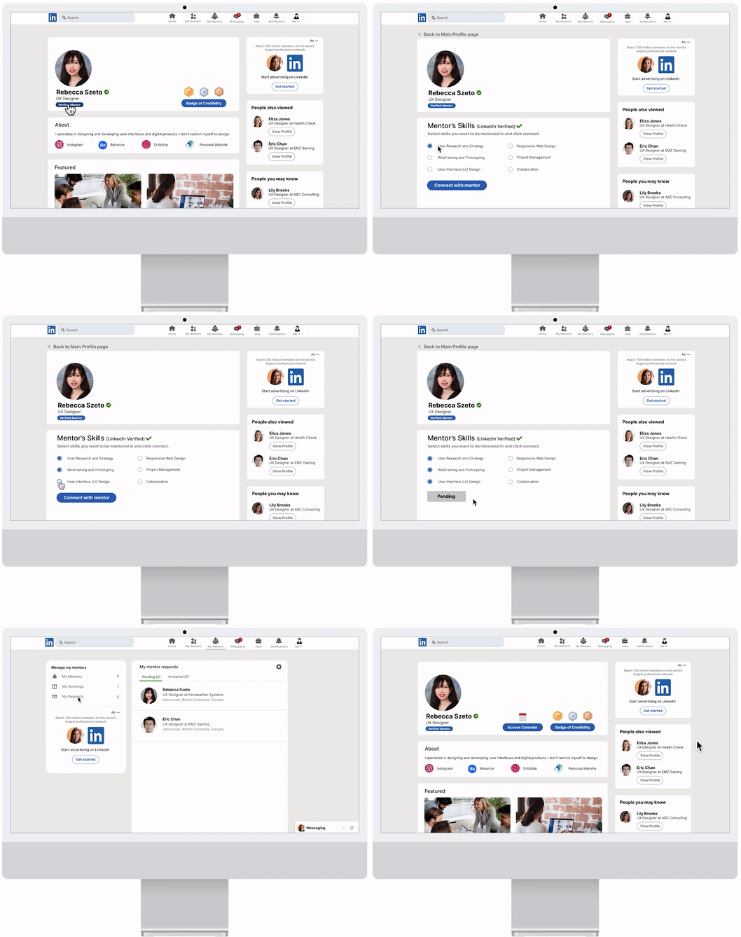
**Note: My instructor also suggested to have the booking system within the LinkedIn messaging dm chat itself because it would make the experience more seamless, hence, I changed all the frames to have it in the chat box instead of where I originally put the booking feature to speak with a mentor (that is, the mentor’s profile page). In the 2nd user testing, I learned from all 5 of my participants that putting it in the profile page where I initially had it would be more understandable and make more sense. It was a hassle changing back all the frames for that feature back to its original placement, but it was a learning experience.**
Moodboard
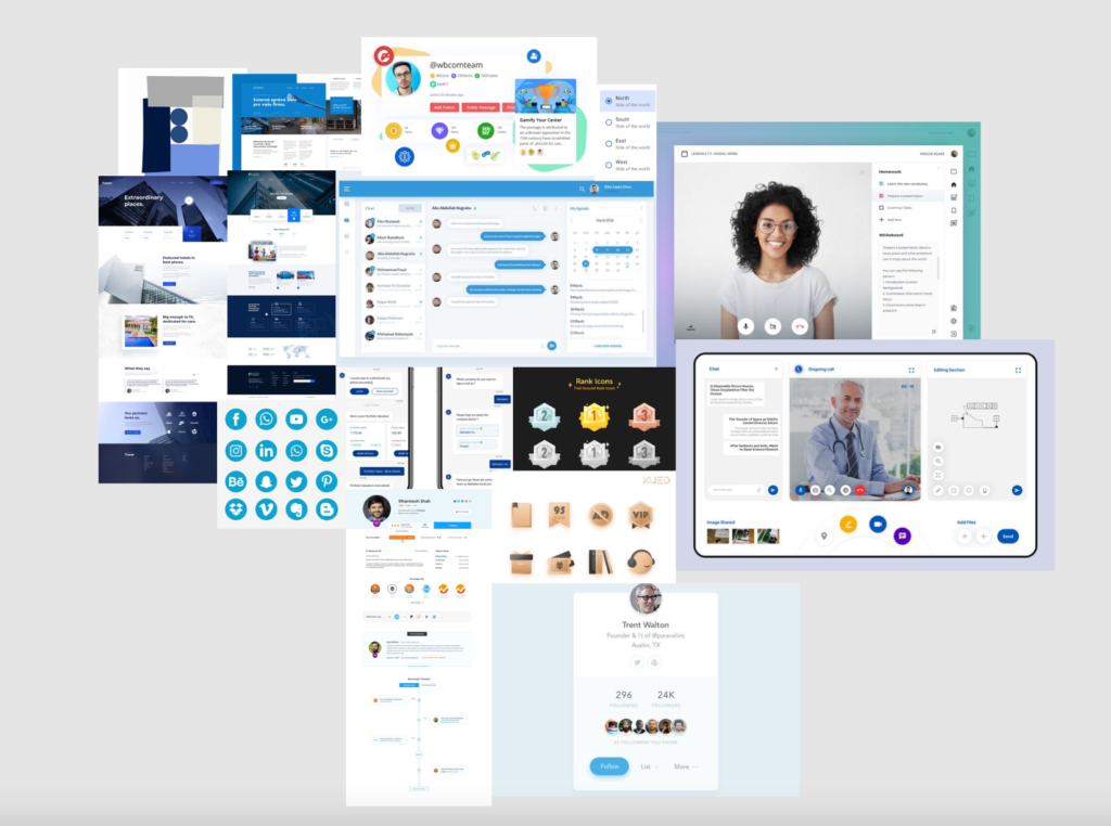
Mood board created to inspire colour palette for overall project and the visual design of features to be built.
Design Style Guide
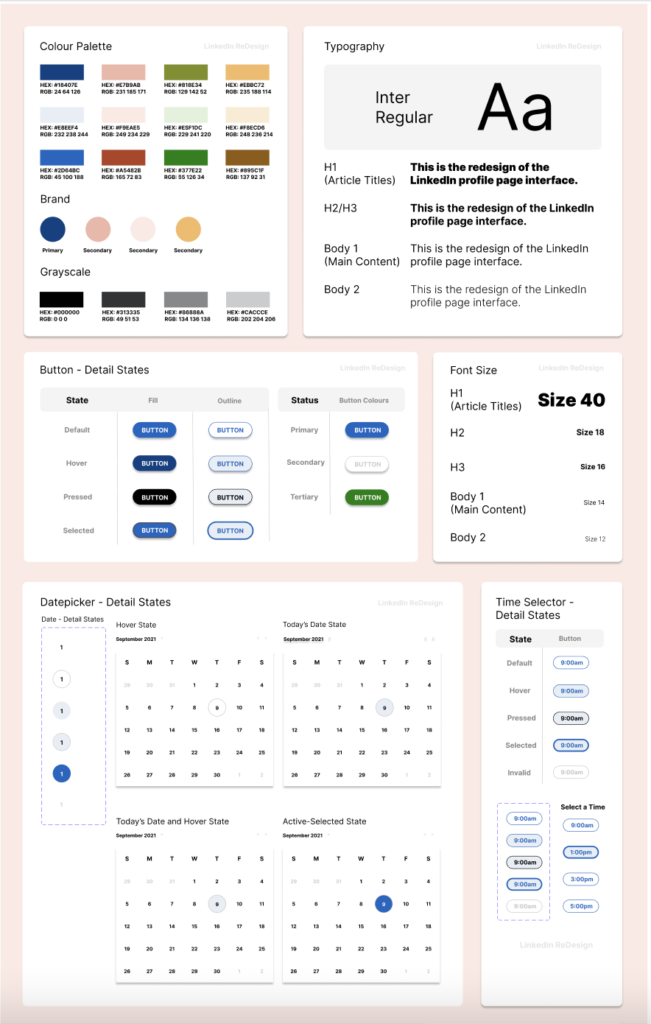
I decided on a colour palette for this project referencing the brand guidelines set out on LinkedIn’s website. Since LinkedIn is currently using a custom font called Community font, I used Inter which comes closest to it.
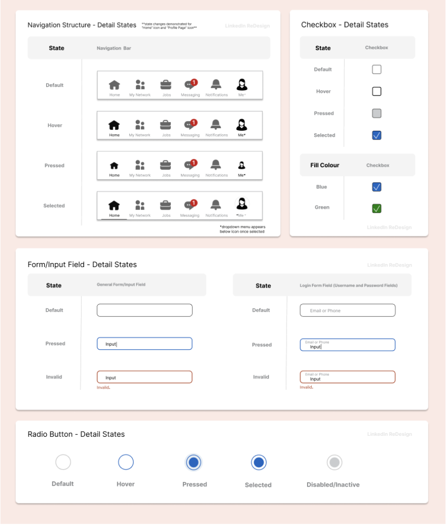
I also created various detailed design states for when the user interacts with different elements (e.g. buttons, radio buttons, checkboxes, inout form fields, etc).
High-Fidelity Wireframes
After the grayscale frames, I created my high-fidelity mockups; adding colours (with reference to the Design Style Guide’s colour palette) to everything in the frames and scaling it to be the same as the actual LinkedIn.
I created various detailed design states for when the user interacts with different elements (e.g. buttons, radio buttons, checkboxes, inout form fields, etc). Prototypes are also created to show the transition between frames. UI animations are implemented to make the overall experience more seamless and realistic.
2nd User Testing and Heat Maps
Main Findings and Action Items
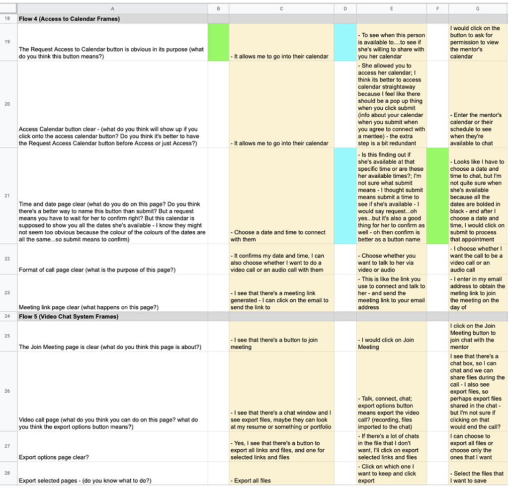
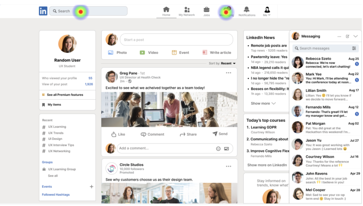
All the participants find having the “Access (to the mentor’s) Calendar” button inside the LinkedIn messaging chat awkward.
Some of the responses received from participants are:
- “I wouldn’t know to go into the messages to find the mentor’s calendar in there…why would I go to the chat to search for my mentor when I’m already on their profile page? It would make more sense to access their calendar right on their profile page.”
- “If it’s in the chat, I would be confused as to whether or not I need to chat with the mentor first before I can book with them.”
Analysis and Next Iteration:
Based on the participants’ feedback and their responses, having the calendar button on the profile page would make more sense for users since that is where they expect to find it. Utilizing my previous low/mid-fidelity wireframes as reference, I’m going to put the “Access Calendar” button back into the profile page. (see Final Screens and Features below for more detailed explanation).
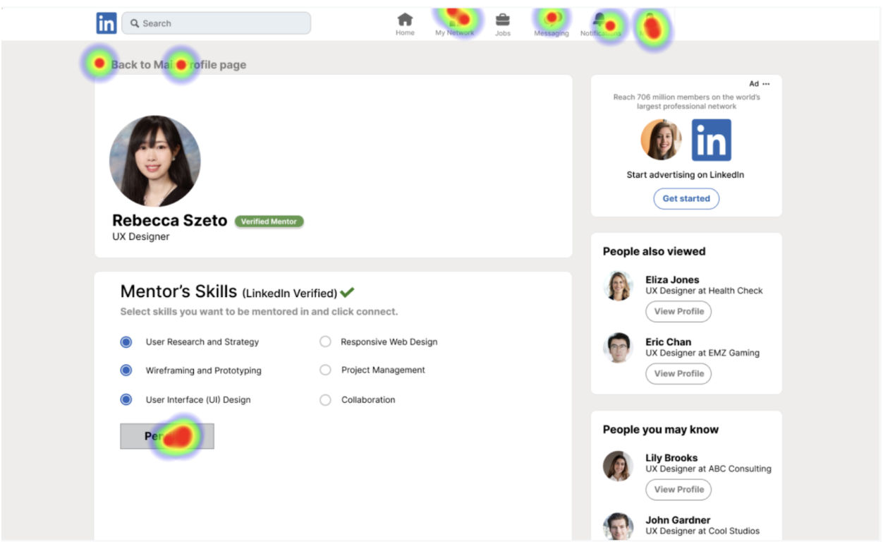
Most of the participants are not sure where to check the status of a connection request sent to a mentor.
When asked how to check the status of a connection request, the majority of the participants tried to search for something clickable on the nav bar. I originally nested the check status of request feature under the “My Network” icon, but most participants weren’t able to find it, or were able to find it only after multiple attempts.
Analysis and Next Iteration:
This comes to show that people don’t intuitively click the “My Network” icon on the nav bar when it comes to checking the status of connection requests sent to mentors. Since LinkedIn Mentorship is a new feature being introduced, allowing it to have its own icon/hub with its own respective information nested underneath makes more sense than putting it into an existing feature, and would cause less confusion. Having a dedicated icon for LinkedIn Mentorship also helps distinguish it from general LinkedIn and establishes a branding for itself. (see Final Screens and Features below for more detailed explanation).
Final Screens and Features
1. Login and Search

Login and Search
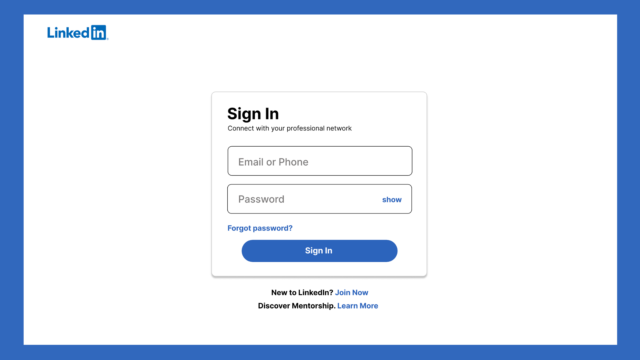
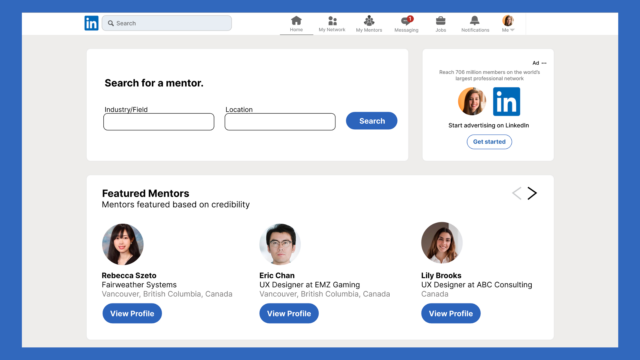
After the 1st user testing, I created an onboarding wireframe series with a different entry point to search and even the mentorship system as a whole could be a standalone ecosystem on the LinkedIn platform. This means that when the user logs in, they can enter a portal and go to a designated mentorship dashboard/ecosystem dedicated for users looking for a mentorship-mentee relationship. This would filter out all other users that are using the main LinkedIn search bar for all other general searches (people (but not a mentor), jobs, groups, etc.)
In this ecosystem, users would go into the ecosystem with a very clear idea of what they want to search – mentors. This ecosystem also helps the user to focus on what they set out to search for without their attention being diverted to other unnecessary content in the search results not relevant to what they’re looking for.
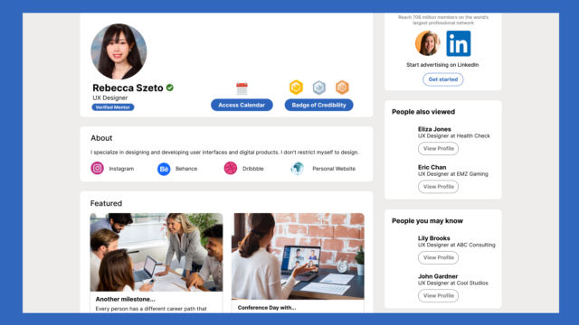
2. Badge of Credibility

Badge of Credibility based on interaction and engagement
- There would be a credibility stats page on the LinkedIn professional’s profile page showing how experienced/influential/credible they are through badges
- A Badge System would clearly explain what thresholds must be met in order for that mentor to obtain that badge – the following are some activities that would contribute to the levelling up in or obtaining a certain badge
- Chat with someone in your field (e.g. If you’re a UX Designer, frequently LinkedIn messaging a lot of other UX Designers on the LinkedIn platform would increase or keep your meter high)
- Attend events/seminars hosted on LinkedIn that’s related to your field/expertise
- Interacting frequently on posts in your industry/field
3. Job/Work Verification System
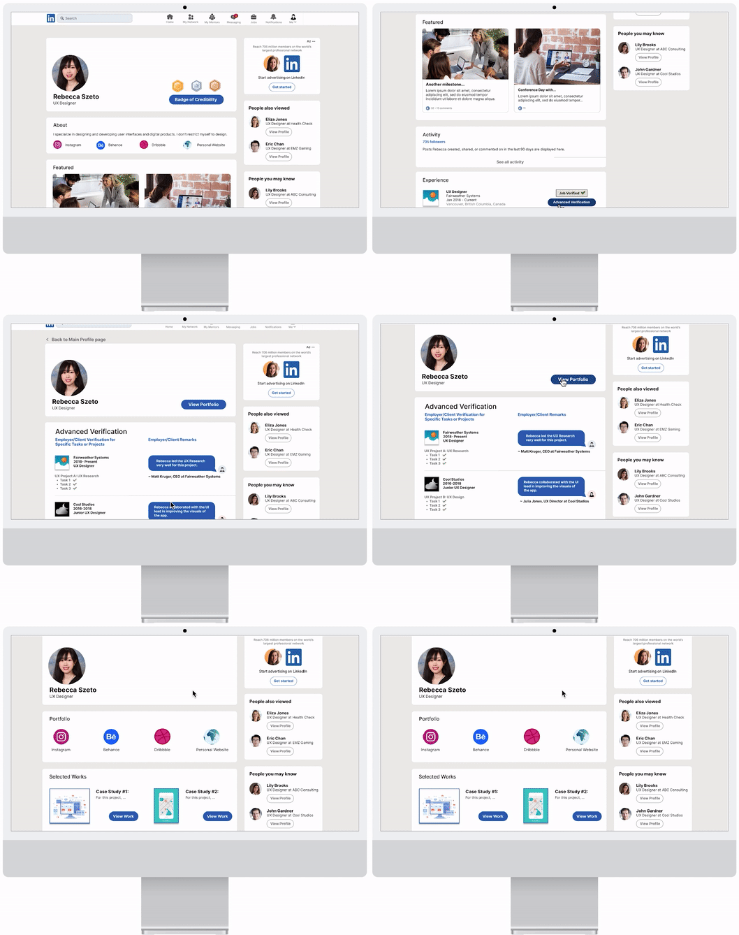
Job History and Work Experience Verification System (verified by employer/clients on LinkedIn)
- To show to the user (the job/career seeker) that the LinkedIn professional is legitimate and that their credibility is being backed by the verification of companies that they have worked for/with currently/previously
4. Vetting System

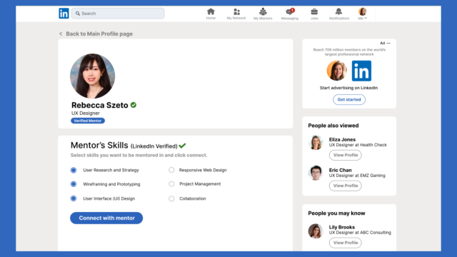
Vetting (Verifying Mentor’s Skills and Credentials) System (Mentees choose skills they want to be mentored in by Verified LinkedIn mentors and send connection request)
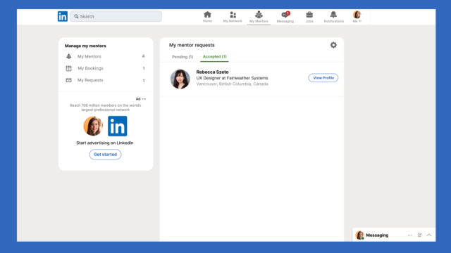
Based on users’ responses in the 2nd user testing, they are more likely to search for a way to view all of their requests than to individually search for a specific mentor via search and view the status (i.e. connection requests) on that mentor’s profile page. (Same for bookings/joining meetings as well).
The iteration would include a My Requests tab under the “My Mentors” icon. By selecting that tab, the user is able to see all connection requests they’ve sent and the status of each (either pending or accepted). If the mentor has accepted, a view profile button would appear next to the mentor, prompting the user to visit the mentor’s profile page where they can book a meeting with them to further the connection.
5. Access to Calendar (Primary Route)
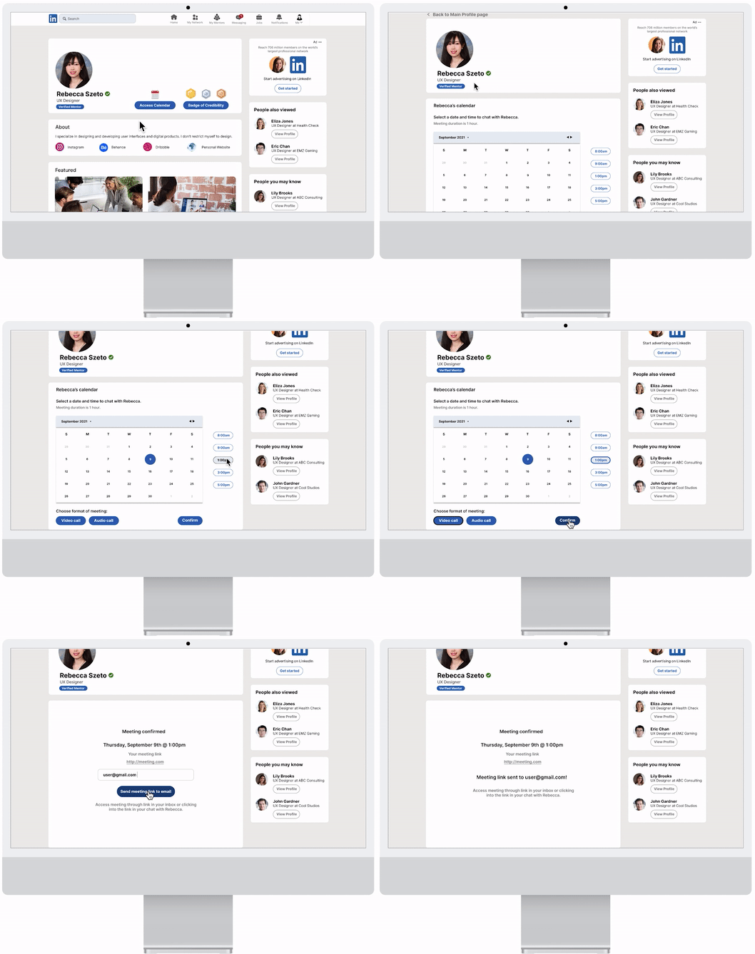
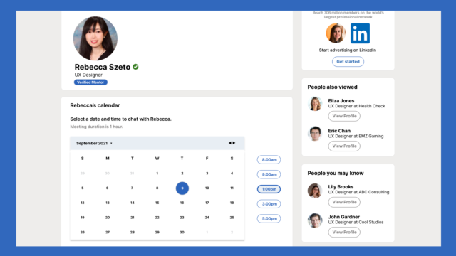
Access to Calendar (mentees can access calendar once they’re connected to the mentor)
- Users can easily access the professional’s calendar to see when they’re available
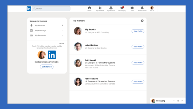
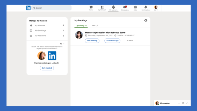
After the 2nd user testing, I’ve created a new set of wireframes to help the user enter the profile page through a new “My Mentor” icon on the nav bar. Once the user clicks on the icon, it’ll take them to a page where it has a list of mentors that the user has connected with and all the user’s upcoming/past bookings. By clicking on the “View Profile” button next to a mentor under the list, it’ll take the user to the mentor’s profile page where the “Access Calendar” button is.
5. Access to Calendar (Secondary Route)

The messaging route path for accessing the calendar and joining the meeting won’t be deleted. Rather, it’ll act as a secondary route for accessing these 2 features.
6. Video Chat System (Primary Route)
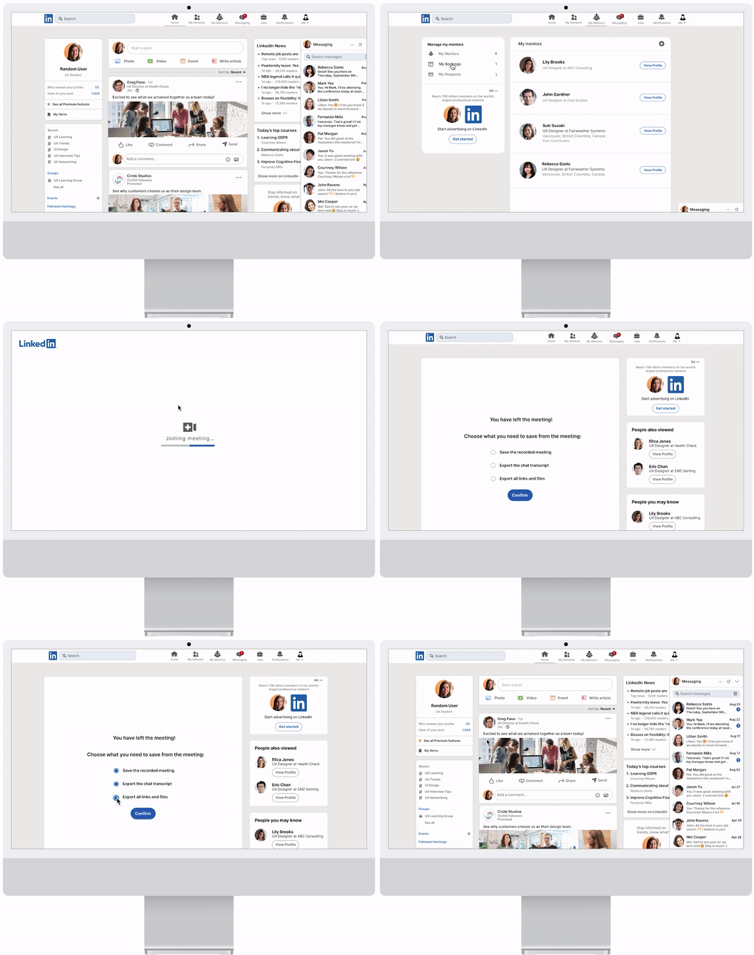
Video Chat System
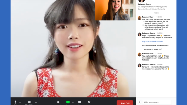
Integrate a video chat system within LinkedIn’s profile page so that the conversation can easily be done with just a click of a button on the interface
- Resources Within the Chat (call/meeting)
- Files/resources that were shared during the call/meeting can be exported for the user’s reference later on
The user can join the video meeting by clicking on “Join Meeting” under the Bookings (includes all the user’s upcoming/past bookings) tab on the sidebar under the “My Mentors” page.
6. Video Chat System (Secondary Route)

The messaging route path for accessing the calendar and joining the meeting won’t be deleted. Rather, it’ll act as a secondary route for accessing these 2 features.
7. Group Mentoring Workshop
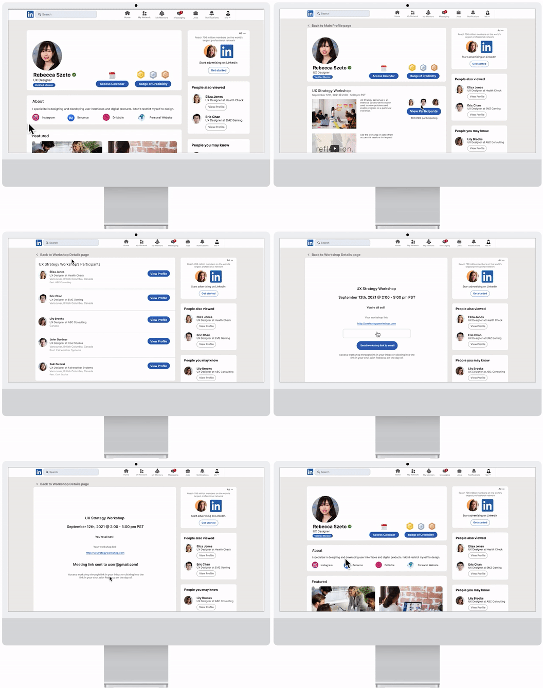
Group Mentoring Workshops
- LinkedIn professionals/mentors can host group mentoring sessions where career juniors in the field can sign up for a group chat/meeting right within the mentor’s profile page
- This offers a more interactive discussion environment and experience (time and date set out by the mentor)
Final Thoughts
Redesigning LinkedIn’s profile page interface is challenging as that requires exploring a territory that already has so much established – what other problem(s) still exist for users? Figuring that out was the first step, implementing the solution of a mentorship platform alongside all existing features, and ensuring that they coexist in harmony meant constantly reviewing the feedback from participants.
With today’s competitiveness in the job market, a person new to a career field faces many challenges. Through conversations with participants, this redesigned web application is something they see themselves finding useful and actually using.
Below, I’ve listed a few metrics to consider in the future for this project.

KPIs to Track for Real Users Should/When this Product does Launch
1. Sign-up rate for LinkedIn Mentorship:
- Reasoning:
- To gauge if there’s interest and demand for the product
2. Engagement Rate of Mentors
- Reasoning:
- Mentors actively engaged on the platform ensures the success of the mentorship platform
3. Conversion Rate of a Mentee Connecting with a Mentor upon Viewing the Mentor’s Profile
- Reasoning:
- Connection is the first step to a conversation! Making sure that conversions are happening can ensure that mentees are interested in the mentor’s profile, and if not, explore further why conversions are lower than expected.
4. Conversion Rate of a Mentee Booking a Time to Chat with a Mentor upon Connecting
- Reasoning:
-
- The purpose is making conversations happen! Measuring that will help track to see how many conversations are being created.
5. Conversion Rate of a Connected Mentee Booking a Group Mentoring Workshop Hosted by the Mentor
- Reasoning:
-
-
- Group mentoring workshops brings the LinkedIn Mentorship community together. It’s a great opportunity for mentees to meet and interact with each other and build community and continuous interest of the platform.
-